The rise of the digital press has seen a tremendous peak over the last years. The audience is increasing as Millennials grow older, demanding all sorts of content. Publishers are prompted to deliver quality content along with a great digital product for readers to experience a different but still unique act of opening up a magazine and dive into it.
CHALLENGE
Design a responsive online platform for a magazine, newspaper or blog directed to meet the needs and goals of one of the presented User Personas. The chosen Persona is the starting point for the project. May need to adjust and adapt based on what is discovered through own research.
PROJECT DURATION
1 WeekREMOTE TEAM
- Miluska Schaeffer
- Magdalena Steinlein
MY ROLE
- Survey construction
- User interviews
- Research Analysis
- Wireframing
- Prototyping
- UI Design
PERSONA
Most digital magazine readers are well-educated, young, and upper-middle class. Recent studies indicate that they are part of the so-called Millennials.
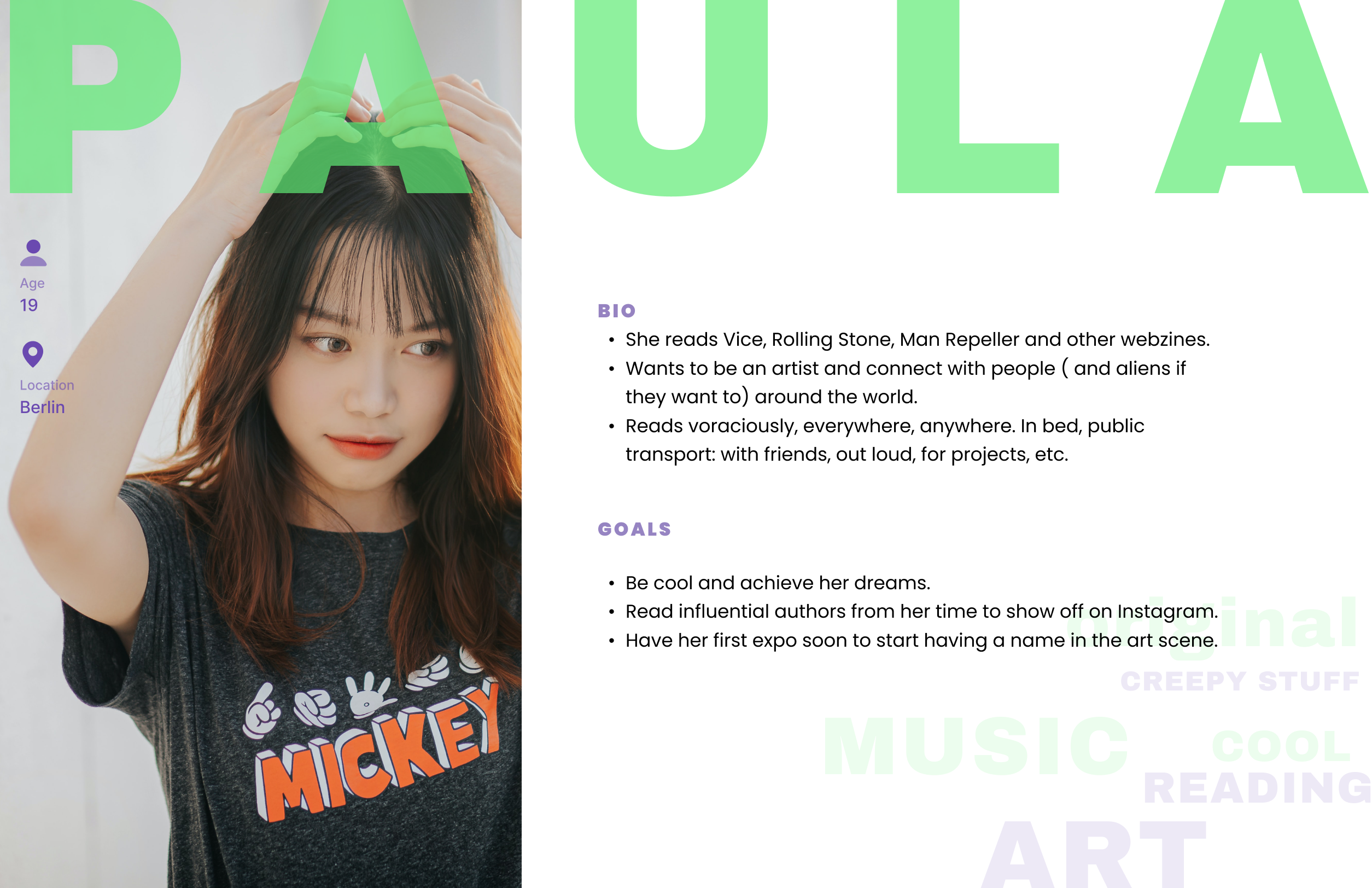
Among the provided user personas, we as a team chose Paula (19) — The Laid-Back Creative.
GUERRILLA RESEARCH
- Asked users of our persona to let us know if they read magazines
- What kind of magazines and content they would find attractive to read.
- This would help us to later work on the information's architecture.
From these conversations, we discovered the users need a platform that not only has fun, interesting & original content but also gives them easy access to it, including from their mobile phones, where they can have their favorite categories & articles to hand whenever they want to read or share them.
VISUAL EXPLORATION
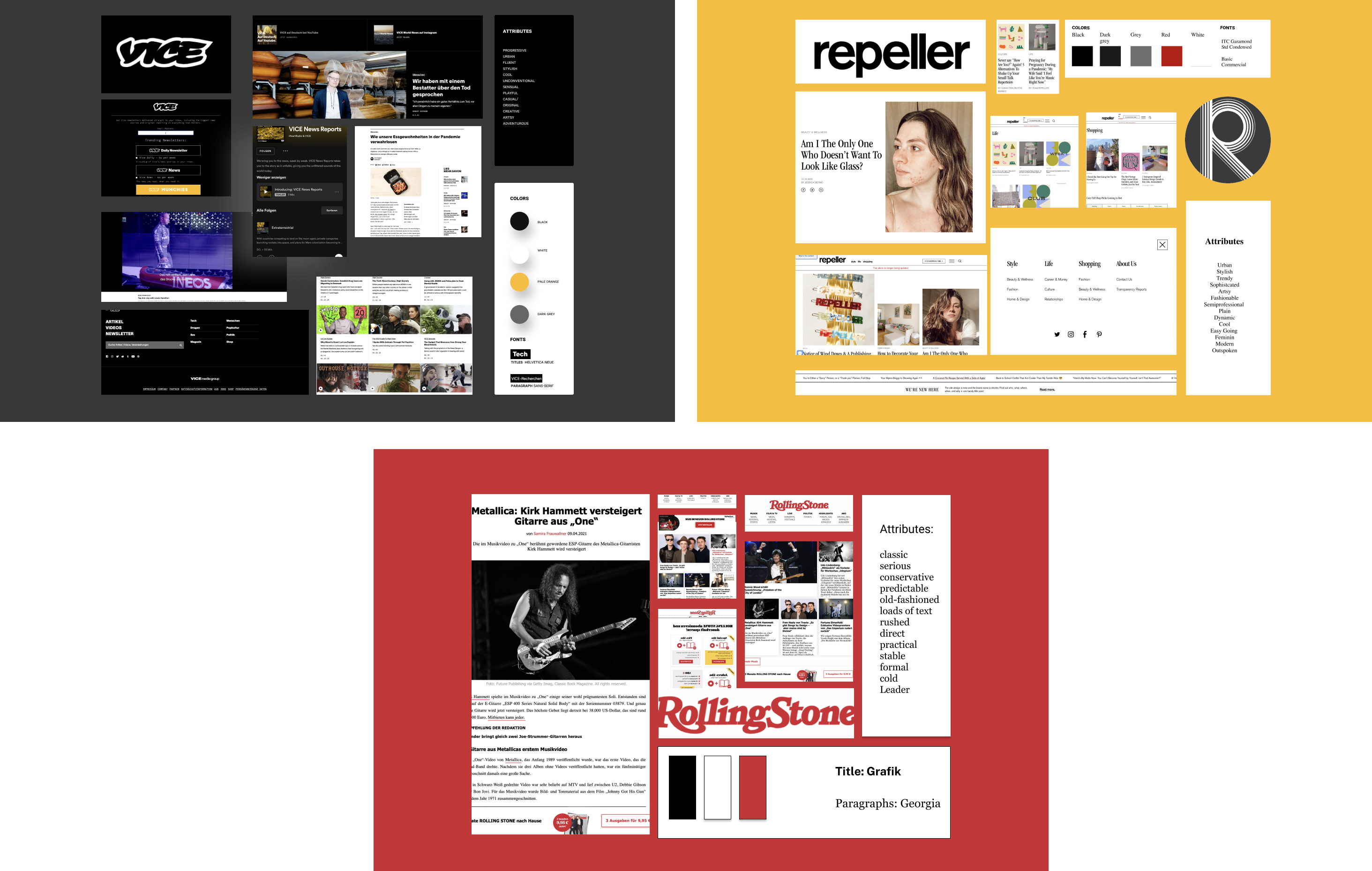
Visual Competitor Analysis
We worked on creating a visual board to analyze the magazines our persona actually reads. In this case. These boards included logos, color palettes, and layout samples of her favorite webzines.
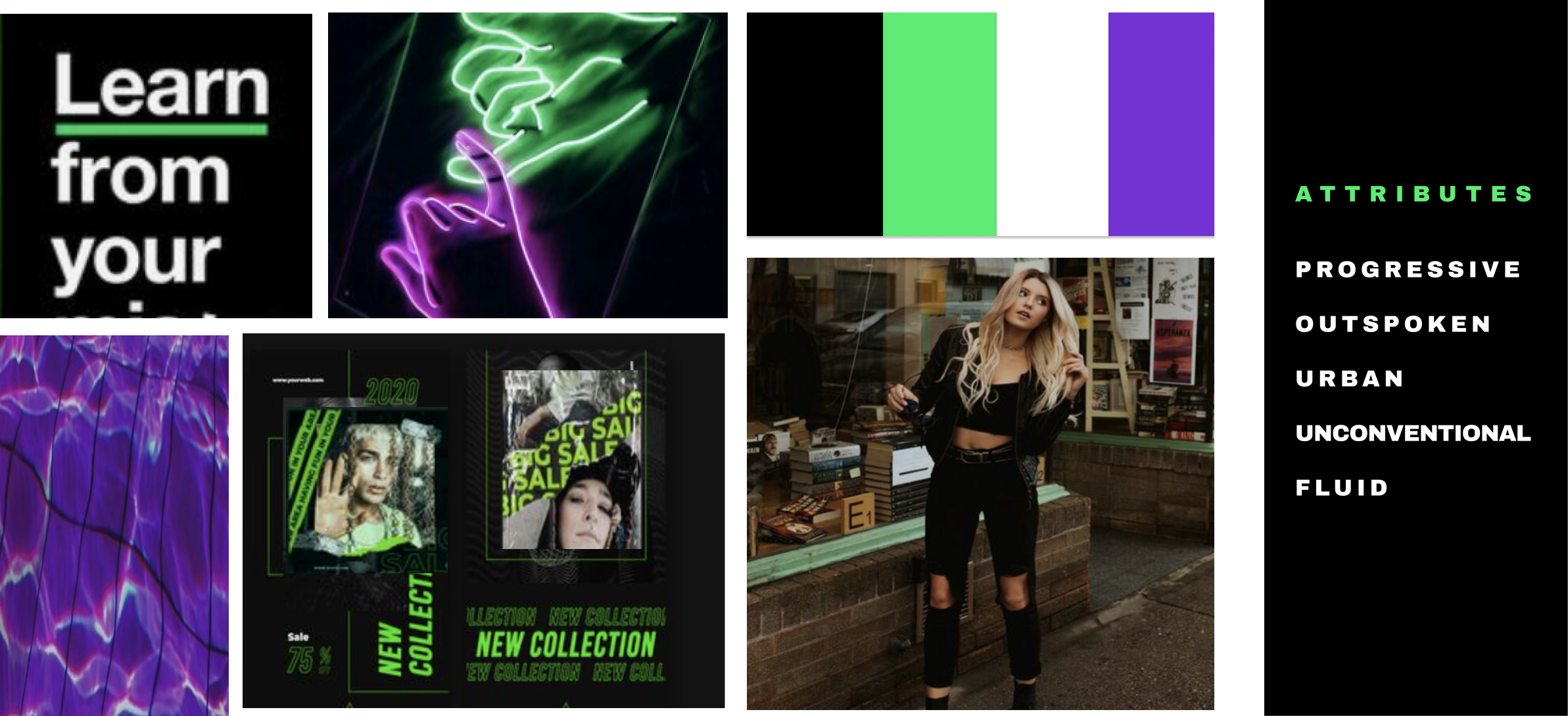
BRAND ATTRIBUTES & MOODBOARD
We worked on a list of 5 attributes that best describe our webzine; with this information, we started creating moodboards containing possible visual elements that we would include in it. These moodboards contained typography, color palette, icon style, and layout elements.
The key here was to be consistent and transmit the right "mood" from our brand.
The way we shaped our survey was by showing the three moodboard options and the list of attributes to let our testers choose which of the boards is the most compatible with them.
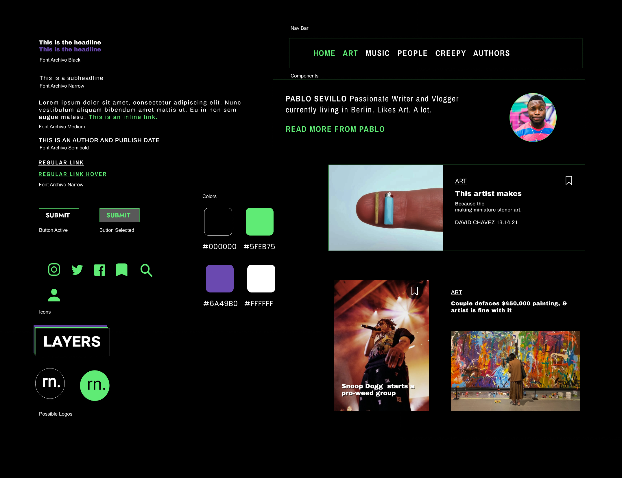
STYLE TILE
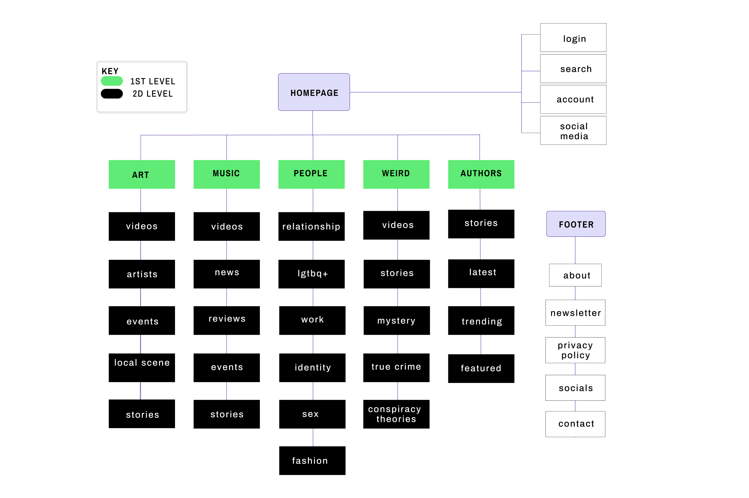
SITEMAP
- Our main theme as a brand was creating a webzine with a focus on art, urban, modern and mainstream subjects. As a team, we created ten possible categories that, partly came from suggestions in a short guerrilla interview and as a result of our tests and our persona, were then reduced to five: Art, Music, People, Weird, and Authors.
- As for the second level of categories, we tested one more time doing card sorting and gave our testers a number of possibilities, which then resulted as follows :
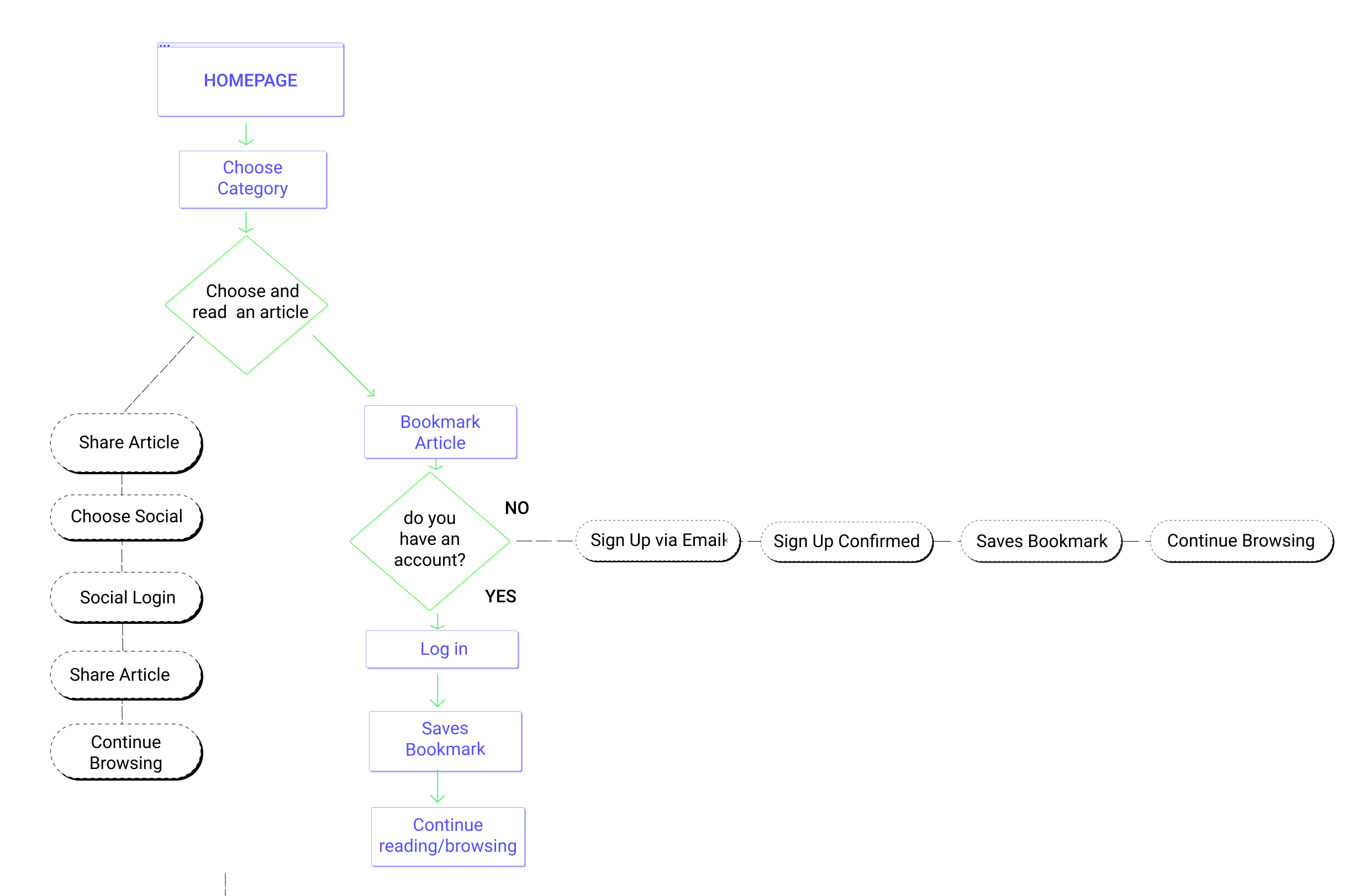
USER FLOW
- Having the structure of our webzine, we passed to evaluating the task that our user would be accomplishing.
- For our user persona, this would be of extra use since she is mostly on the go, using different devices and reading at any chance she has.
MID-FI
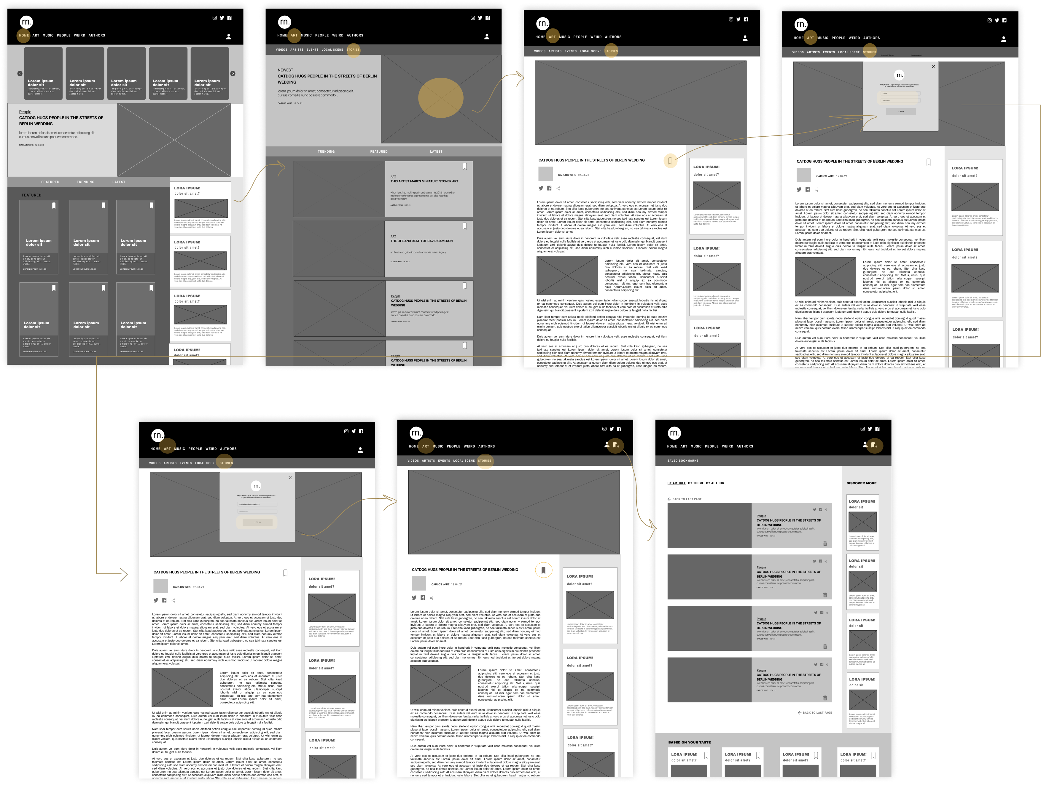
Feedback
After testing this mid-fi, we received some very interesting and punctual recommendations on different points, which we then changed on the high-fi:
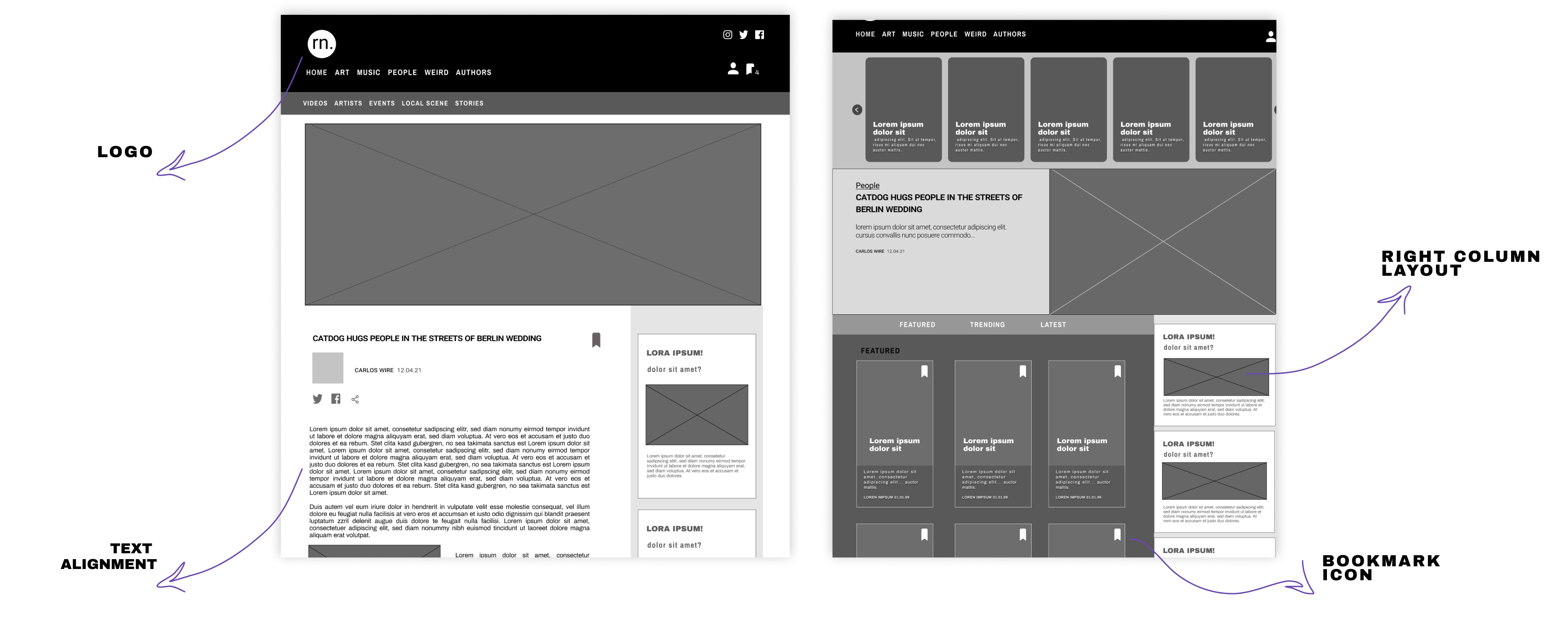
- Our first idea of having a recommendations column on the right was also too wide and made the size of the article's image look awkwardly short.
- Our bookmark icon wasn't easy to see.
- The text on the article page should be changed to be aligned to the left.
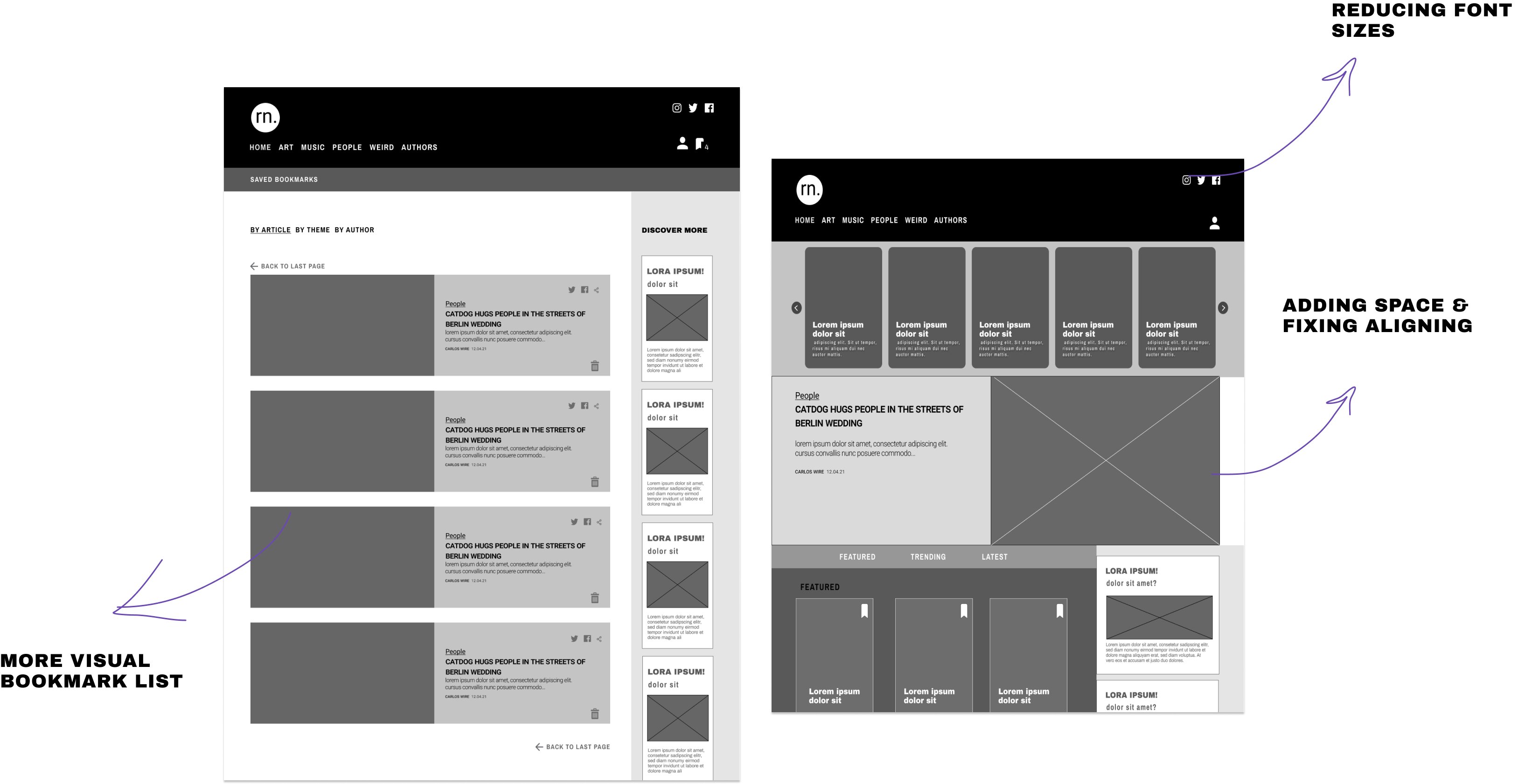
- The user's bookmark list page seemed a little bit off and heavy, we needed to think about how to reduce the scrolling.
HIGH FIDELITY PROTOTYPE
Feedback
After iterating based on our tester's feedback, we passed to our high-fi, which after three usability tests, also went through changes like:
- Choosing a different logo.
- Reduced the presence of the black color inside articles.
- Made the articles font bigger for better readability.
- It is important to mention that, right from the beginning of hi-fidelity prototyping, we noticed how difficult & uncomfortable for the eyes the color purple in contrast with black looked like. The main reason why we decided to stick to gray, black & green.
NEXT STEPS
Further usability tests and iterations of our current design.
Interview more users with similar characteristics to our persona to asses the content & categories of our webzine.
Asses how valuable would the option to bookmark an article inside the own page, hence this would make more sense for the users if implemented with a mobile application where they can easily access their saved content for later.