Daily routines and schedules have become extremely hectic and hence, the popularity of all kind of tracking apps has increased significantly, specially the ones related to fitness, wellness & health.
CHALLENGE
Designing a tracking application related to the health and fitness sector. The work will culminate in a high-fidelity prototype of a native app that reflects the best path forward based on research, iteration, and testing.
PROJECT DURATION
2 WeeksREMOTE TEAM
- Miluska Schaeffer
- Danielle Okamura
MY ROLE
- Survey construction
- User interviews
- Research Analysis
- Wireframing
- Prototyping
- UI Design
IDEA
As for this point, we only had the very basic idea of building a stress tracking application, so we started by doing user research and discover what are the opinions of the users on this kind of apps in general, who would be interested in using such an app and what they would expect to find in it.
USER RESEARCH
Survey
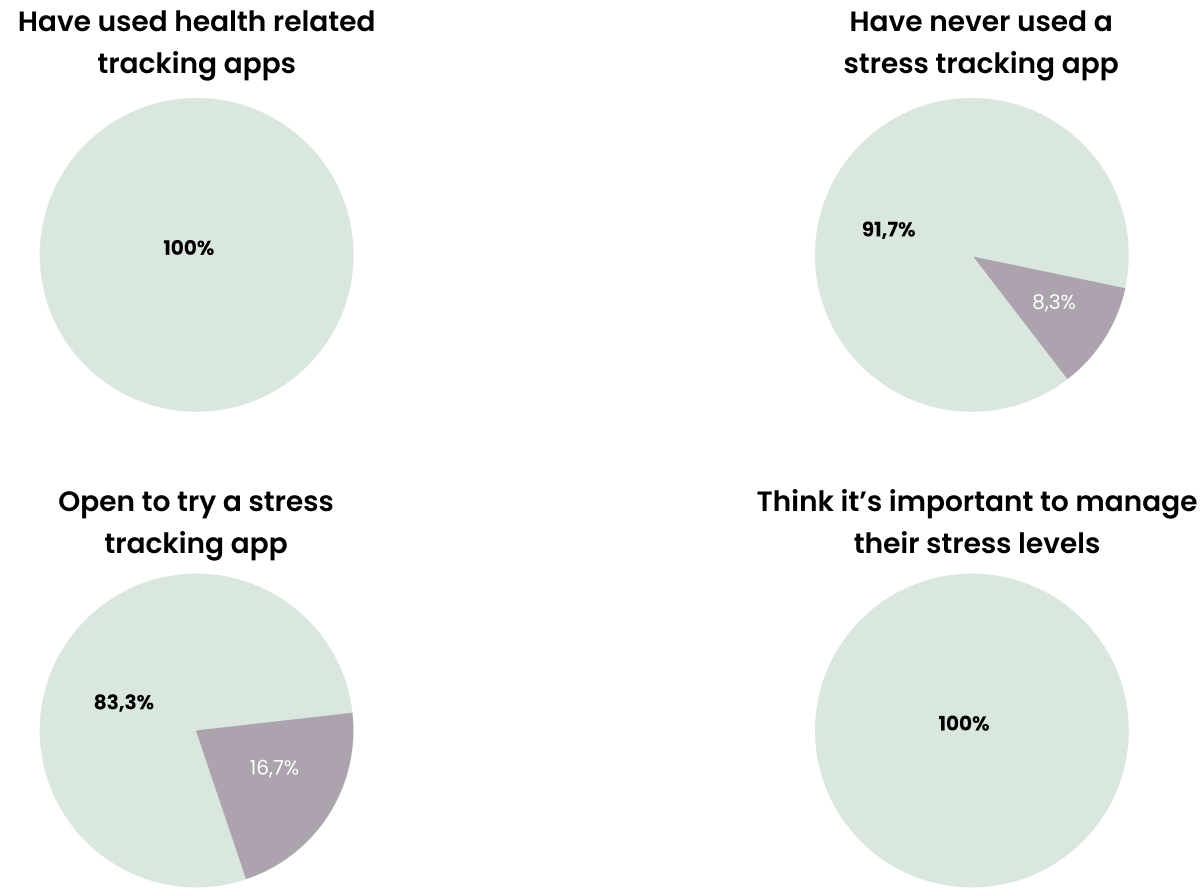
We conducted a survey which led us to the following points :
- They have a positive opinion of this kind of application in general, they believe they are a useful tool.
- When thinking about stress, the main factors they recognize to influence it directly are not having time to relax, not sleeping enough, and eating badly.
- When asked about ways to track their stress many users mentioned activities like journaling, taking short pauses, breathing exercises, and meditation.
- They mentioned it would be very important for the app to have useful information on how to reduce stress.
Interviews
To have a more profound view of our user's opinions and confirm the information coming from the survey, we continued our research by conducting interviews, from which we gathered the following points :
- They mention recognizing their mood and its changes as directly connected to their stress levels.
- Had no experience with a stress tracking app but are very open to trying one that is direct, easy-to-use & won’t get complex with time.
- Are aware of how important it is to reduce their stress.
- Would like it to be personalized & give them positive reminders based on their previous information, that could help them not only to reach a goal but long-term and give them a personal, journaling-like feeling.
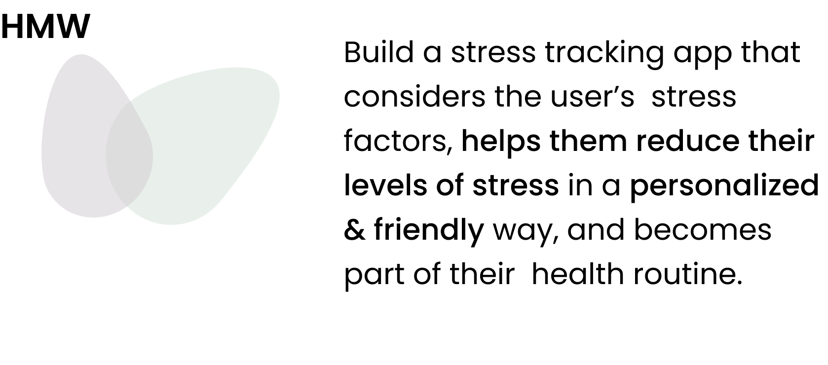
HOW MIGHT WE?
Choosing a final HMW question helped us to see the problem from a specific angle and focus our work to arrive at a possible way to solve it more efficiently. The next one was our final HMW :
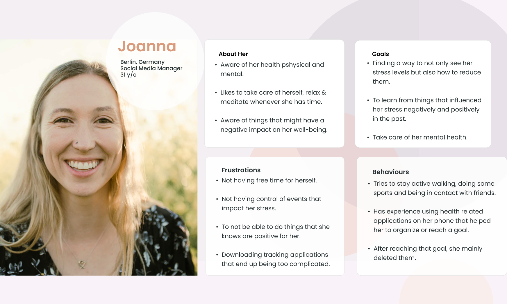
Persona
Having narrowed down the problem, we worked on interpreting the data coming from the user in order to create a user persona.
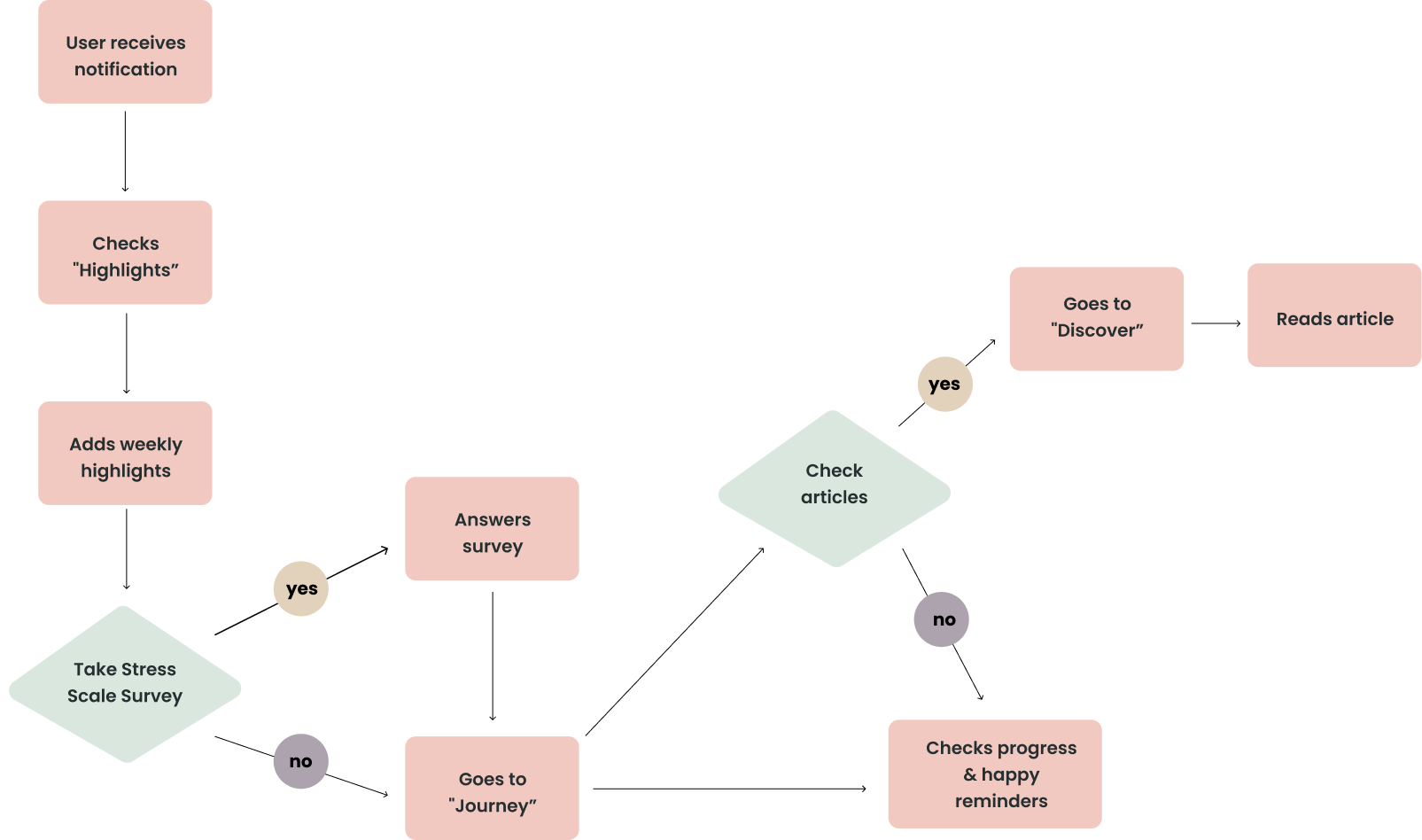
User flow
LO-FI
Knowing the features we would implement for this MVP, we starting sketching what would be a Lo-fi prototype from the whole application, including a welcoming for new users. This helped us to have a first base of the app’s structure, which then we used to build our user flow on the next step.
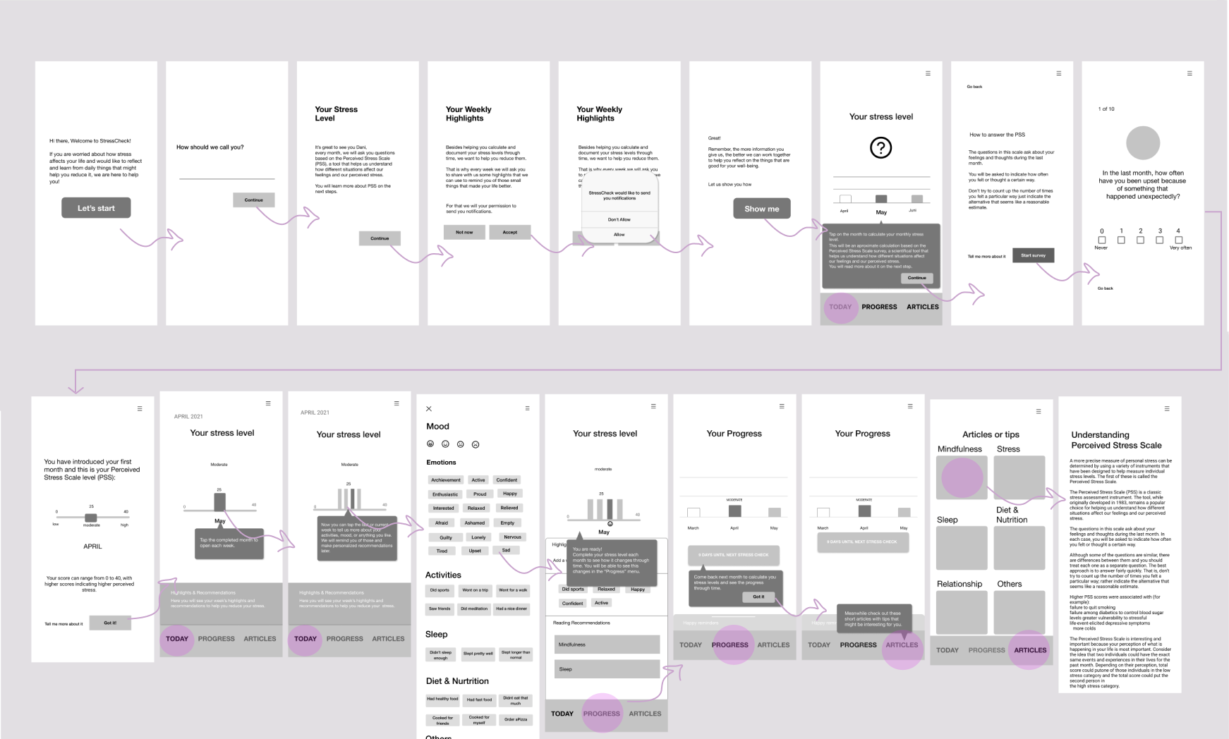
MID-FI
After testing the first Lo-fi and having positive first feedback we jumped into working on a mid-fi prototype.
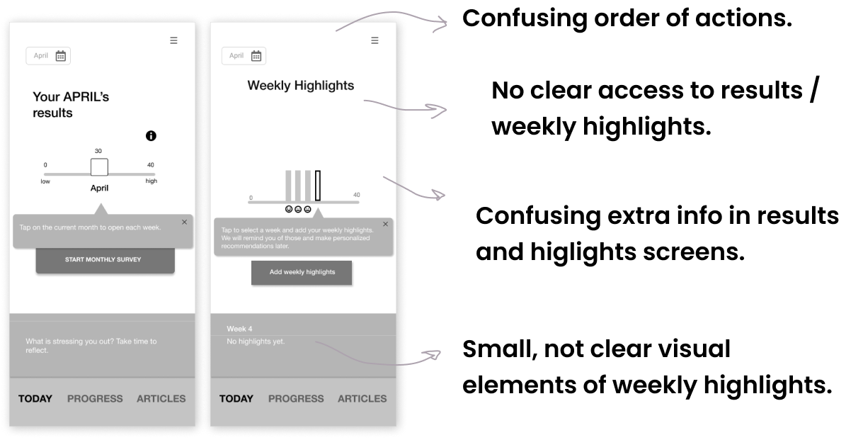
After testing this mid-fi prototype, we received the following feedback :
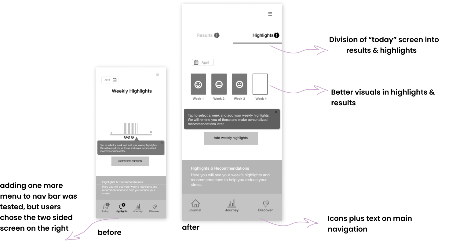
- At this point, it was only possible to access the weekly highlights screen from the “today” menu, by clicking directly on the month graphic, which made it confusing how to access both, monthly results & weekly highlights.
- Showing the monthly results as the first step before the weekly highlights was also confusing. In the minds of our testers, it made more sense to deal with the weekly action first and then pass to the monthly one.
- Visual elements indicating the weekly highlights of each week seemed too small and not so attractive for the testers.
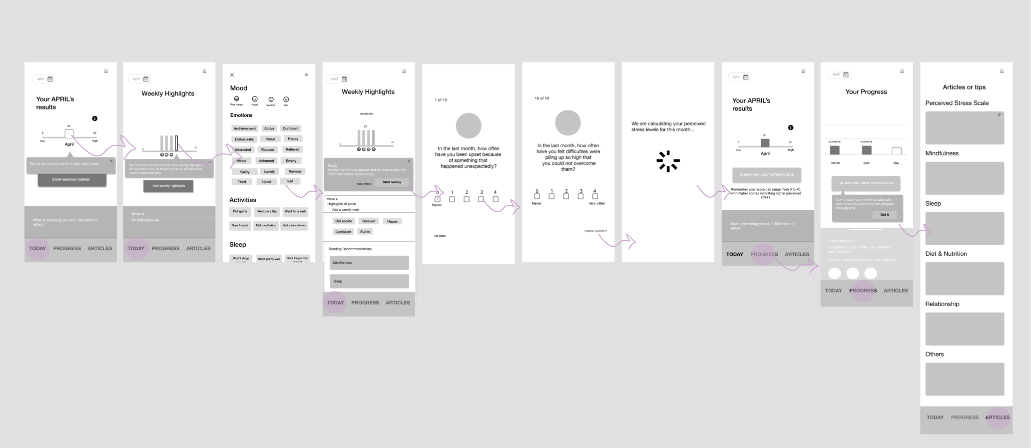
Iterating
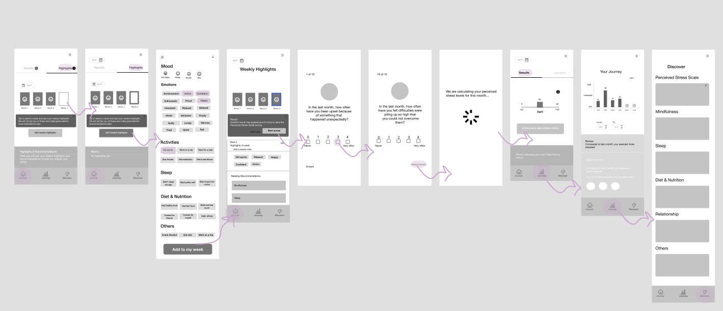
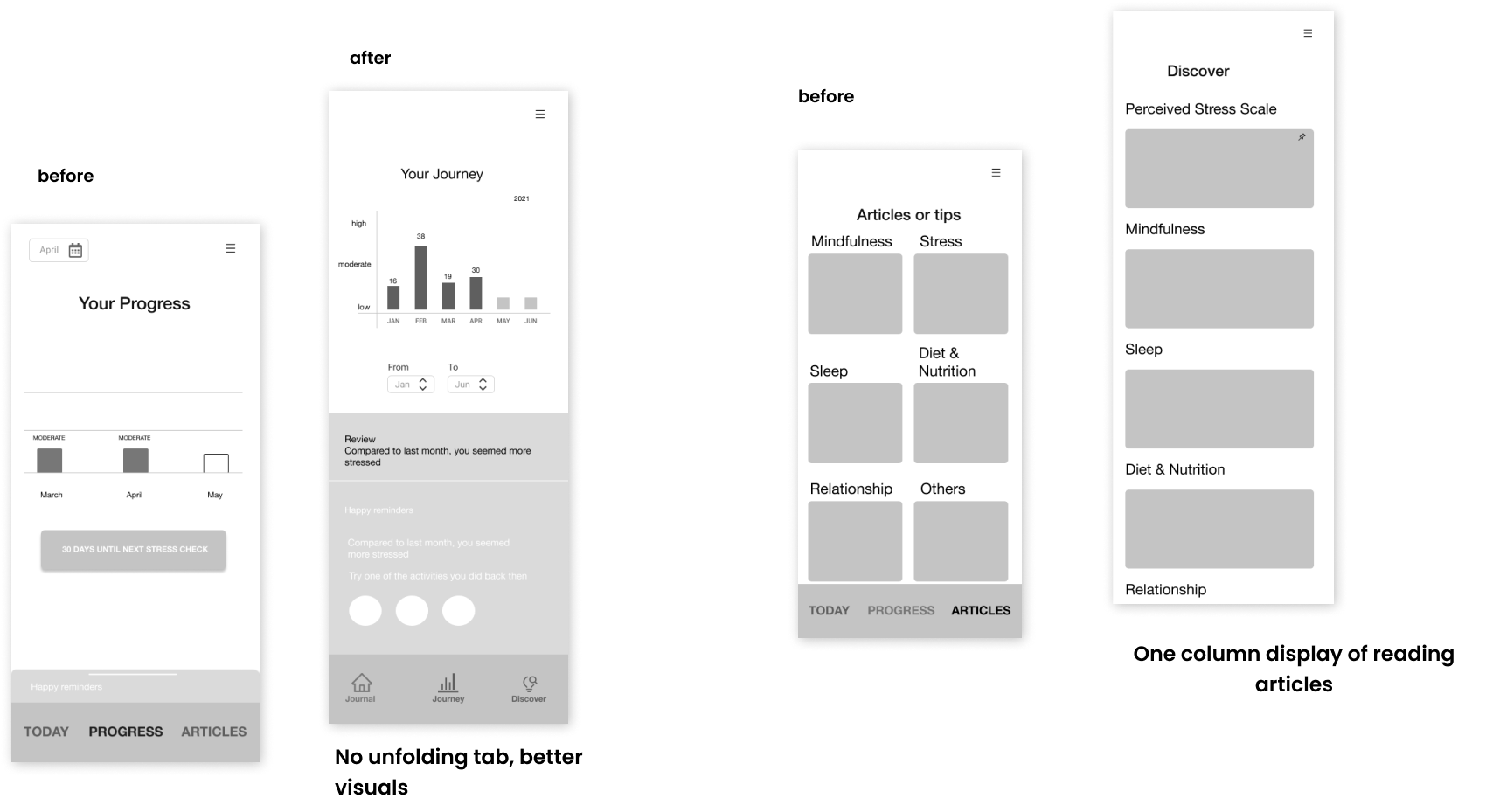
Considering all the feedback we received on the last iteration, we made some changes and built this second mid-fi prototype, which mainly includes :
VISUAL IDENTITY
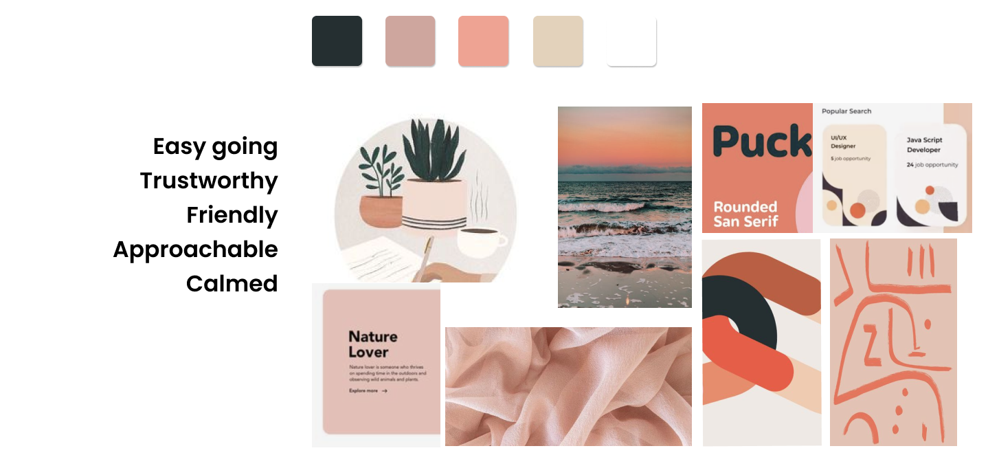
Moodboard
Style Tile
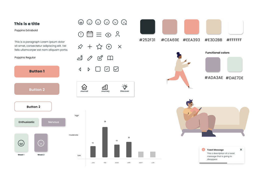
Considering all these points, we came up with the name “Ease” for our brand and a very smooth & simple logo that would reflect the essence of the whole app.
HIGH FIDELITY PROTOTYPE
Before this final version, we tested a previous one, receiving the following feedback:
- The text on the phone notification was misleading, we changed it from “how is your week going” to “how has your week been going”.
- The info box on the “Highlights” screen was not visible enough. As it was very important for the user to read that piece of info, we changed the color to make it more visible but still, maintain the whole tone.
- The same issue was present on the results page, where the cards including reading recommendations were not visible enough.
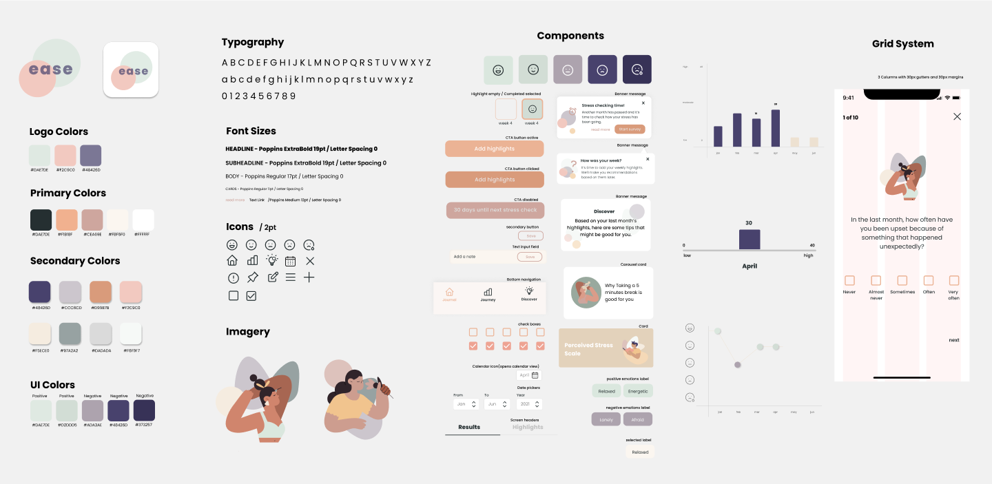
Style Guide
It was a great experience working completely from zero and see our product take shape according to our findings.
NEXT STEPS
Run more usability tests to make sure the tasks in our high fidelity prototype are clear.
Especially gathering more opinions on the length of the stress level survey.
Doing a visual assesment of the whole app, considering the look and feel & name & logo.